Last updated: 19-11-2025 07:13This is a demo site built using Quarto and Python. Check out
the full Substack post here.
Code
import seaborn as sns
import matplotlib.pyplot as plt

# Function for generating the Seaborn plot
def plot_stock_timeseries_seaborn(df):
    """
    Creates a Seaborn line plot for all columns in the DataFrame.

    Parameters:
    df (pd.DataFrame): DataFrame with float columns and DatetimeIndex as index.
    """
    # Set Seaborn theme
    sns.set_theme(style="whitegrid")  # White grid background

    # Initialize the figure
    fig, ax = plt.subplots(figsize=(8, 5))

    # Add a line for each column
    for col in df.columns:
        sns.lineplot(data=df, x=df.index, y=col, linewidth=2.5, label=col, ax=ax)

    # Customize the plot
    ax.set_title("Tech Stocks Indexed to 2023-01-01=100", fontsize=16, loc='left')
    ax.set_xlabel("", fontsize=12)
    ax.set_ylabel("", fontsize=12)
    ax.legend(fontsize=10, title_fontsize=12)
    ax.grid(visible=True, linestyle="--", alpha=0.6)
    for spine in ax.spines.values():
        spine.set_color("none")

    # Show the plot
    plt.tight_layout()
    plt.show()

# Generate the Seaborn plot
plot_stock_timeseries_seaborn(data_rebase)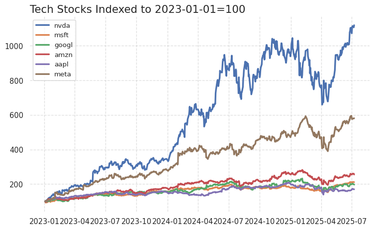
Code
from datetime import datetime
import pandas as pd
import matplotlib.pyplot as plt
import seaborn as sns
# Create a seaborn time series plot with a white grid theme using an ax object
sns.set_theme(style="whitegrid") # White grid background
fig, ax = plt.subplots(figsize=(8, 5))
sns.lineplot(data=df, x=df.index, y="Ggdpnow", linewidth=2.5, color="blue", ax=ax)
# Customize the plot
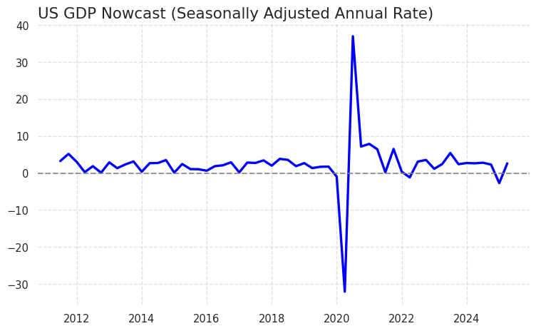
ax.set_title("US GDP Nowcast (Seasonally Adjusted Annual Rate)", fontsize=16, loc='left')
ax.set_xlabel("", fontsize=12)
ax.set_ylabel("", fontsize=12)
ax.grid(visible=True, linestyle="--", alpha=0.6)
ax.spines["left"].set_color("none")
ax.spines["bottom"].set_color("none")
ax.spines["right"].set_color("none")
ax.spines["top"].set_color("none")
# Add a horizontal line at y=0
ax.axhline(0, color="gray", linestyle="--", linewidth=1.5, alpha=0.8)
# Show the plot
plt.tight_layout()
plt.show()